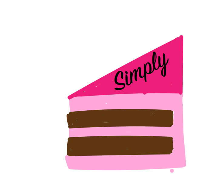
 For my logo I decided to make a cake slice, it goes along with baking and can pretty much stand alone and it would symbolize baking. I decided to freehand my cake slice in illustrator and I kind of underestimated how hard it was going to be, it did turn into a fun challenge and the Undo button was probably my best friend. I really like how it turned out with my freehand, just need to clean it up a bit and try to make it look more professional. I need to look at more tools to try to make the edges neater, but I do kind of like how it looks drawn. The simply I just used a textbox to make the “simply” probably because I didn’t want to free hand that. The whole thing is suppose to stand for “Simply a piece of cake” because that’s what baking should be, a fun mess of well fun. I didn’t do much besides use the pencil tool and the paint brush tool to make my piece of cake. I really like chocolate cake so I used that as the base and then pink frosting so it looked different from the chocolate cake part. I made the pinks contrast since in real life the pinks wouldn’t look the same in the light, it added depth to my photo and made it a little less 3D in my opinion. With the cake part I tried to make them as even as I could while eyeballing it. I’m sure there is a tool that would help with that, but I personally had fun freehanding it I just need a way to try to clean up the edges. I likely liked using this program, it was all you, no photos. This project was just fun all around.
Draft logo


Kayla, I really like the simplicity of your logo. It is easy to process and understand what it is representing and is not too flashy. I think if you clean up the edges and do some touch ups it will make the logo look more uniform and professional. There are parts that are not colored in all the way and you can see the white behind it, so fill in those parts as well. At first I did not like how the text fit but after looking at the logo for a little bit I actually think the text fits well. I also like how the whole title “Simply a piece of cake” is left out and only “simply” remains because it is up to the audience to infer the rest. When I first saw your logo I saw “simply” and then the cake and immediately thought of “Simply a piece of cake.” The only concern there is that not everyone may catch that reference and could be confused on the meaning of your logo. Overall, I really like how simple your logo is and how it was freehanded and I think with just a few minor improvements it can be a really cool logo!
LikeLike
Looking back at my work I can say that I really need to clean up my lines and make sure that the whole thing is colored throughout. By making these changes it can help the whole logo and make it look more professional. I can say that I need to learn more tools and how to use the program to my advantage and stop trying to color in the shapes and try to see if there is the fill in bucket. I could try to make to make it more 3D, and try to make more shapes using vector tools and other tools. Overall I just need to clean up the logo and try to make it look less handmade and more computer made. I just really need to try harder and give myself more time to finish the assignment, which I am giving myself more time to do the final.
LikeLike
This is gonna sound kind of mean, but I actually preferred your draft to the final logo!!! Something about the simplicity of your first attempt made your logo feel more homey and soft, which is something I like to look at and feel when I see and eat baked goods. Your final logo feels too rough to me. I like the overall colors and idea for your logo, but I think that the “simply” could have better placement, like maybe below the slice of cake, or hovering above it! I also think that the slice of cake feels too uniform. The layers feel too defined, and solid. I don’t know if you were going for more of a graphic design look for your logo, and if you were then these things would be a good fit, but I think the simplicity of your draft was pretty nice, just needed to be cleaned up a bit with some dimension.
LikeLike
Hi Kayla, I guess this comment won’t be the most helpful as I see that you have already posted your final draft. Overall I agree with the comments that you directed towards yourself about cleaning up the lines, using the fill in bucket, and utilizing a few more tools discussed and used in the tutorials. If I had a piece of advice I wish I could of provided you it would have been to maybe clarify the term “simply” that was placed on the cake. Is it simply baking co.? Not sure what the logo was for, but that is okay because in the end it is all about the design. Either way I really enjoy your vision, you were a go getter on this project and I was excited to see your final product!
LikeLike